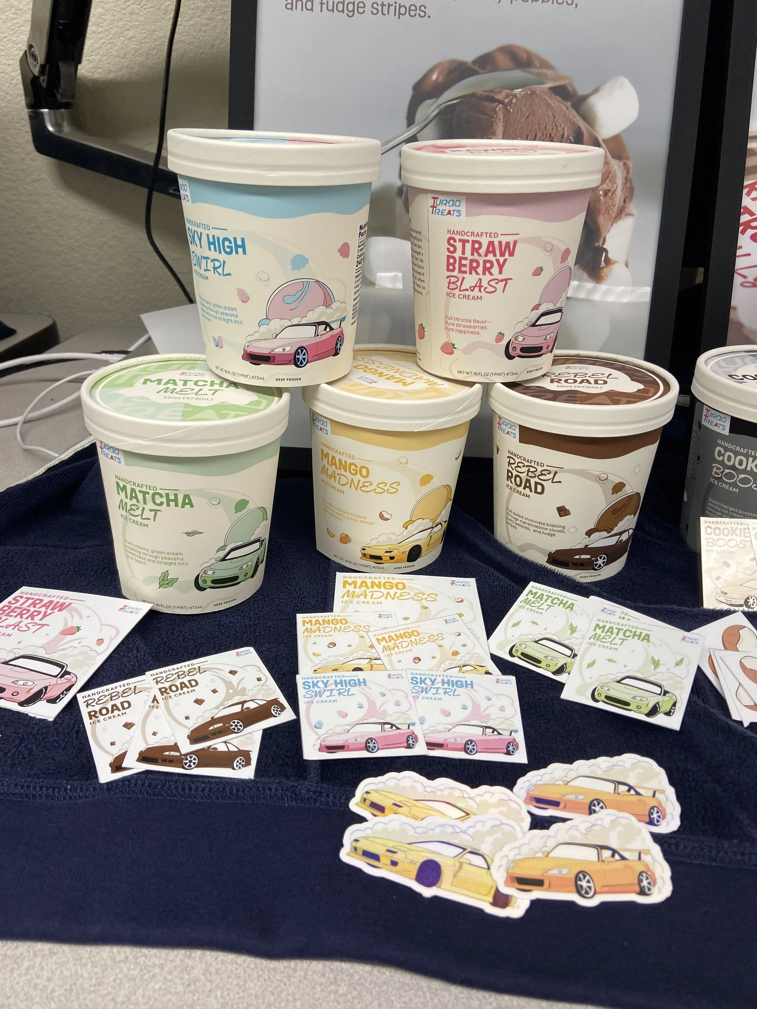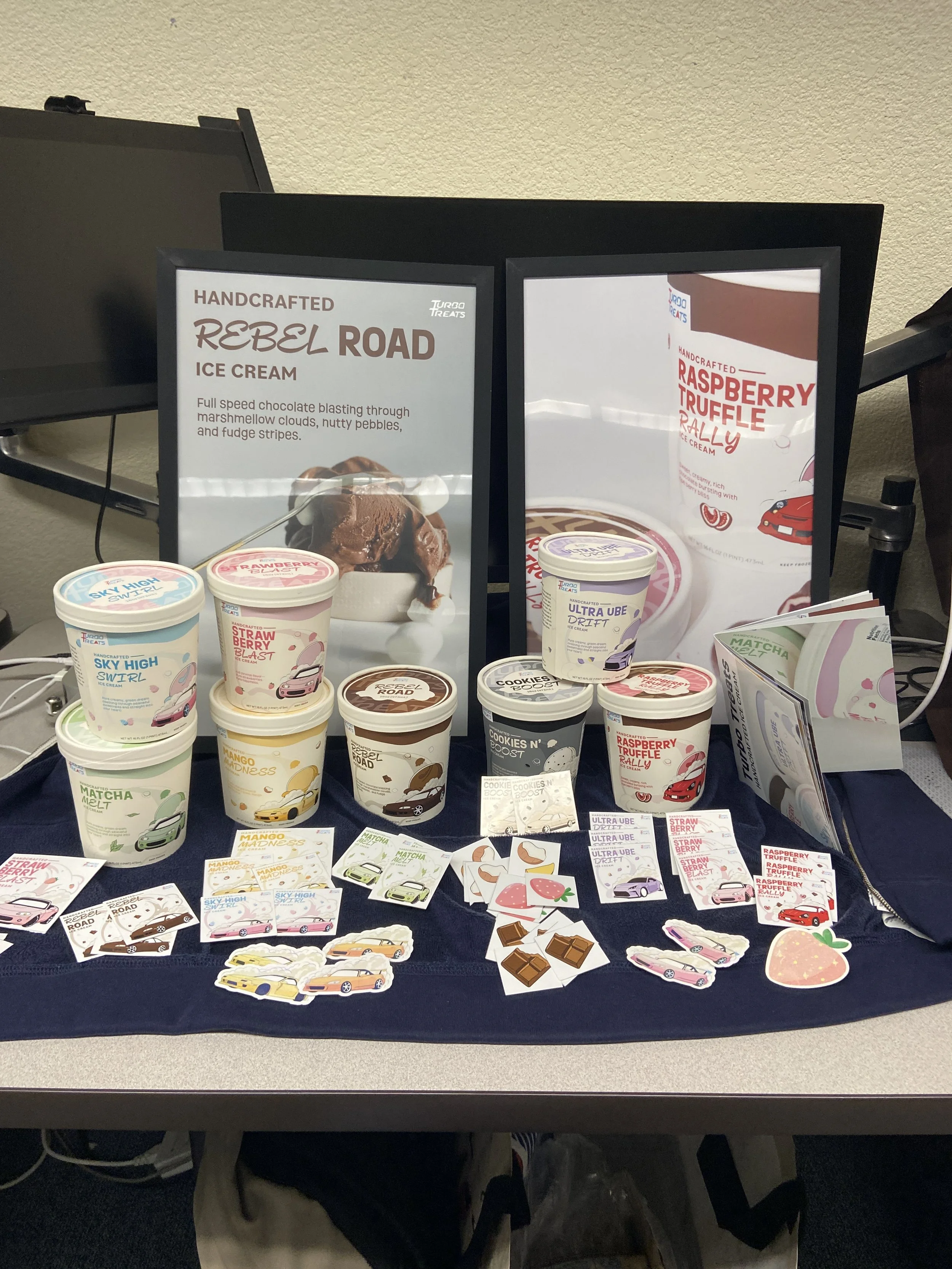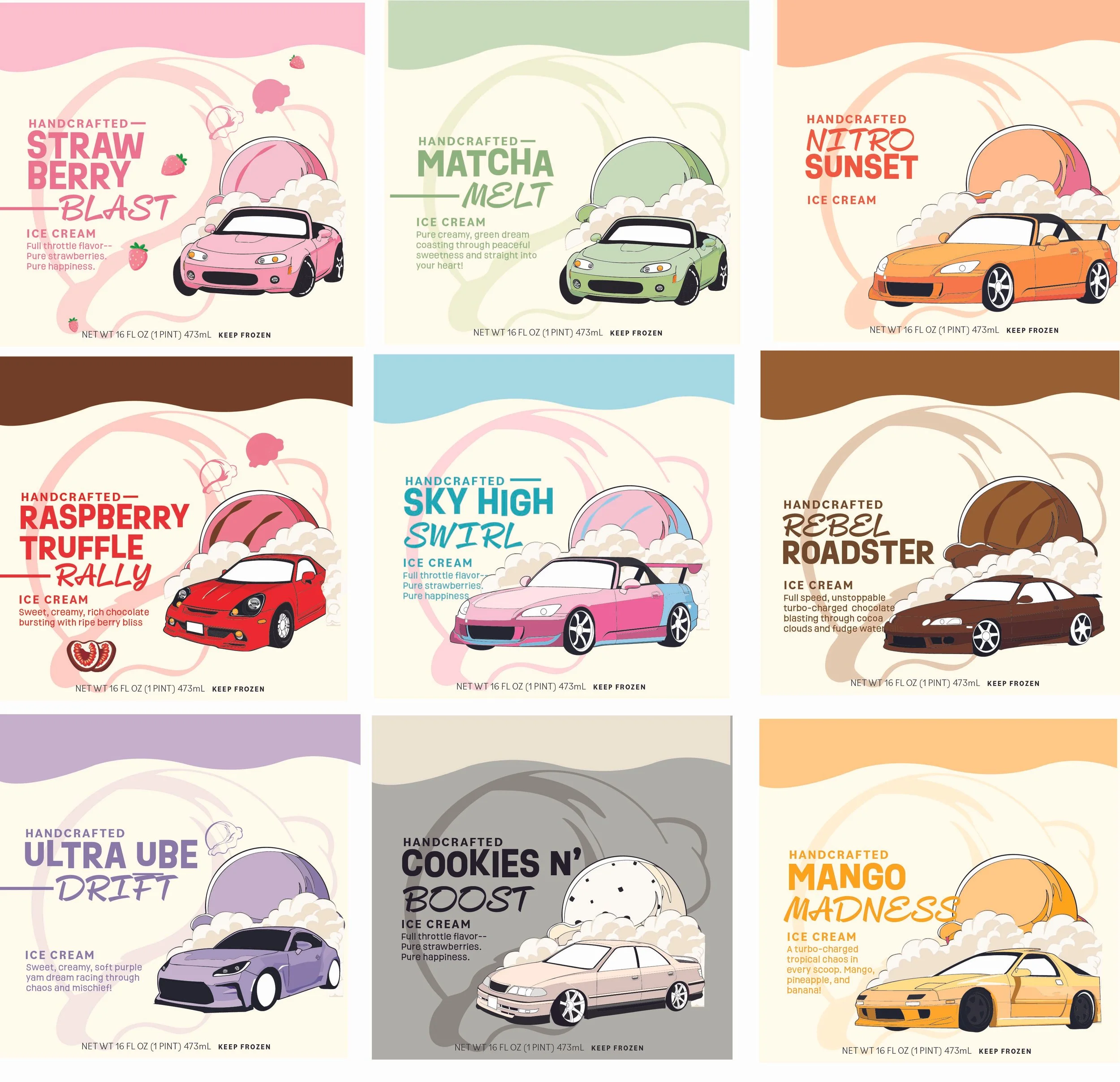
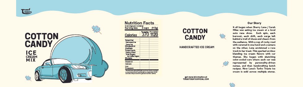
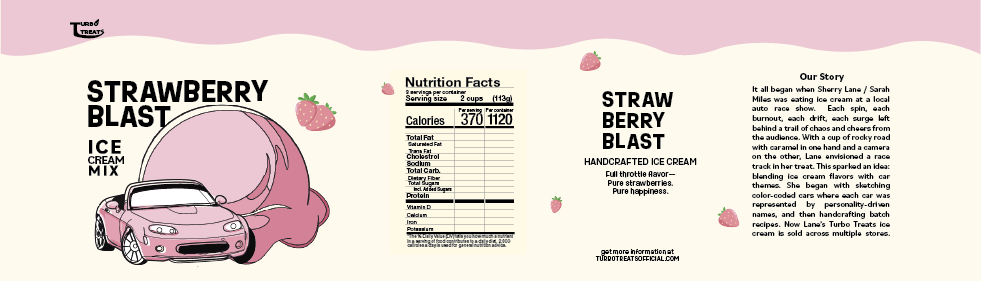
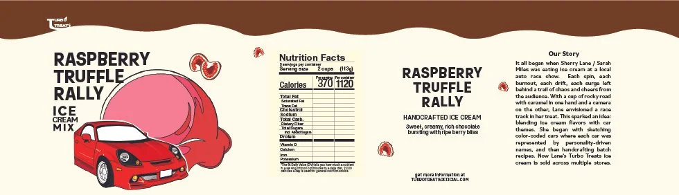
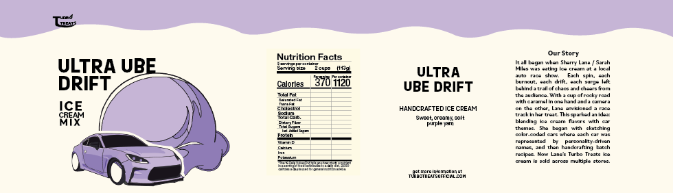
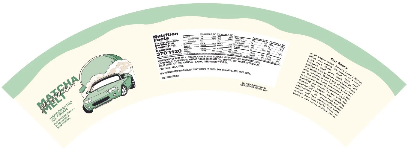
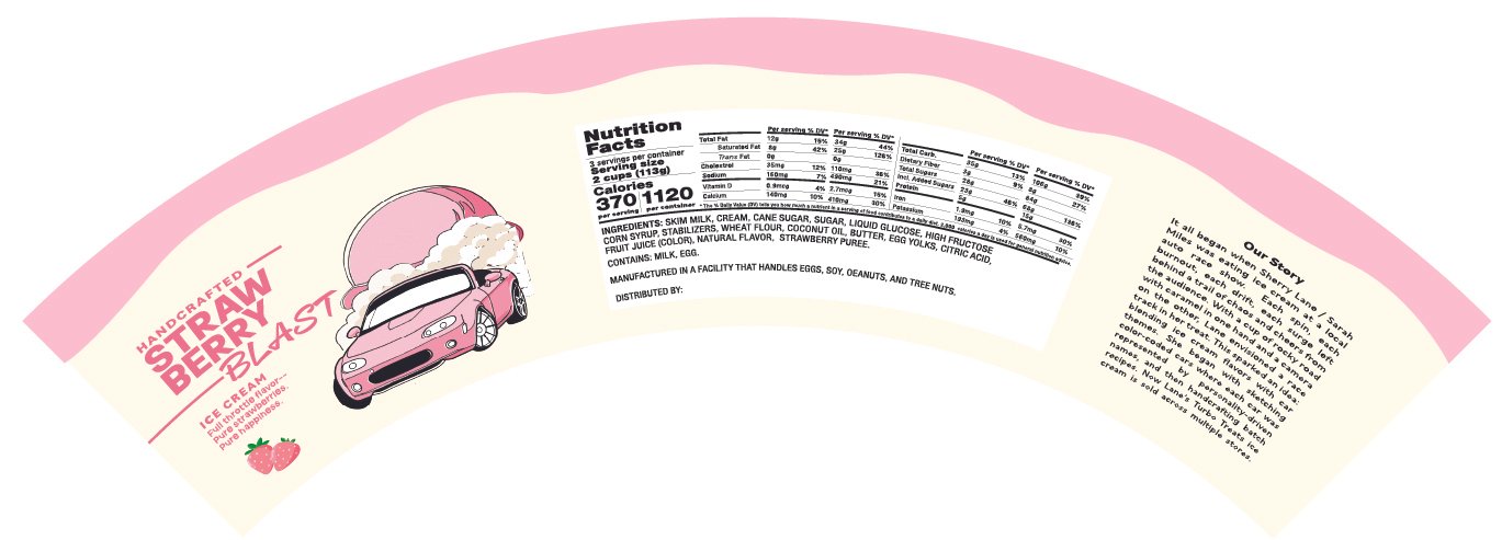
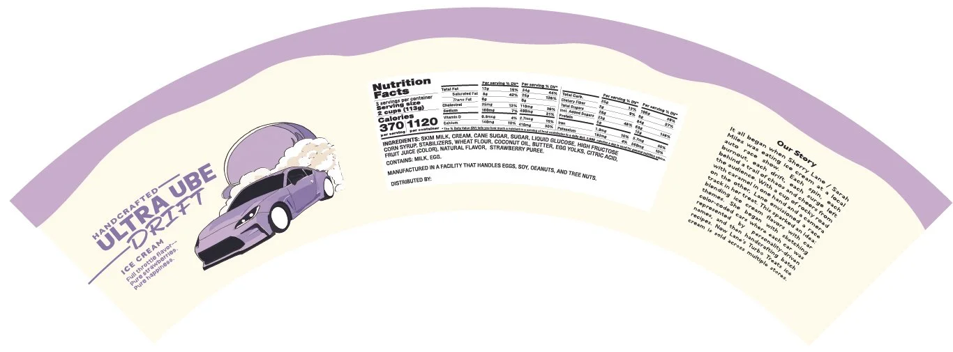
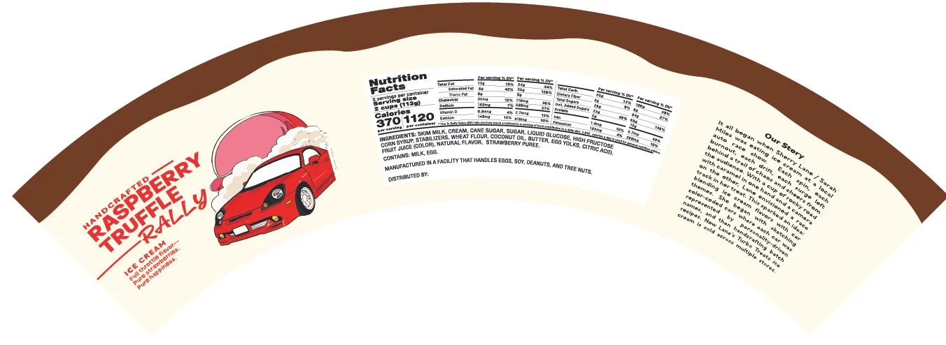
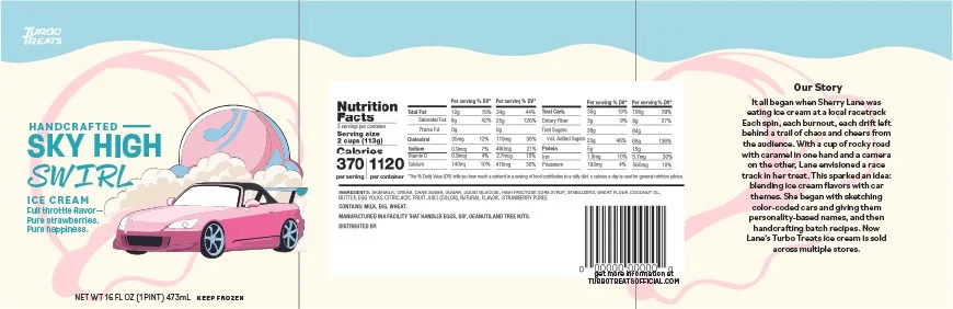
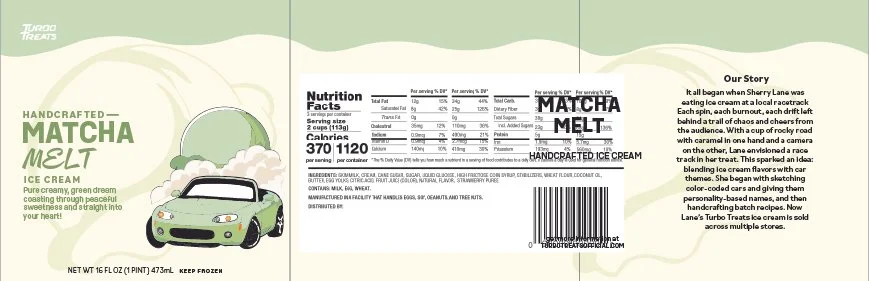
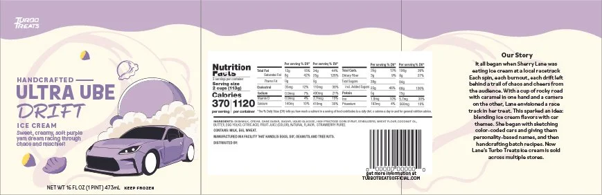
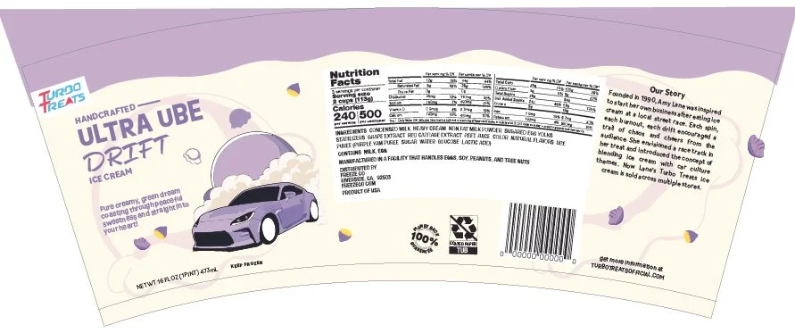
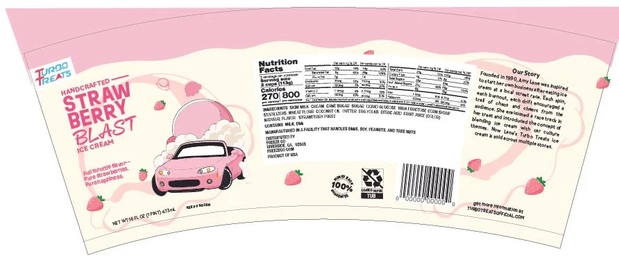
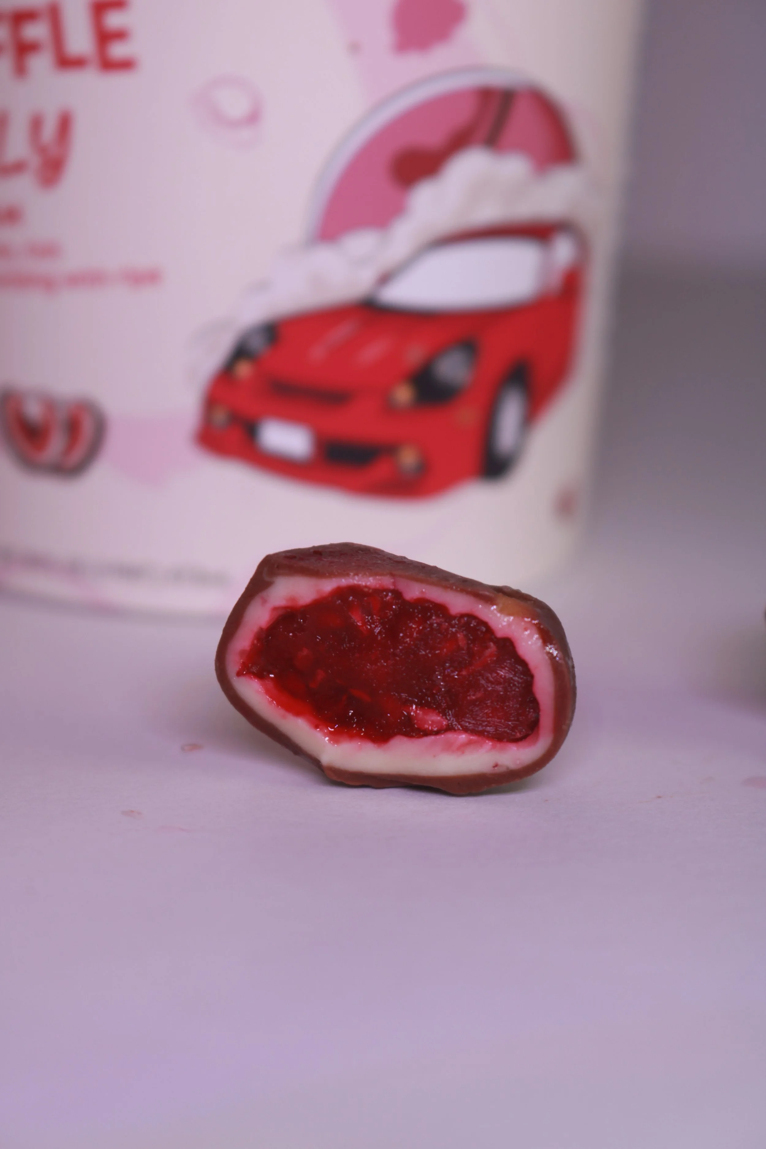
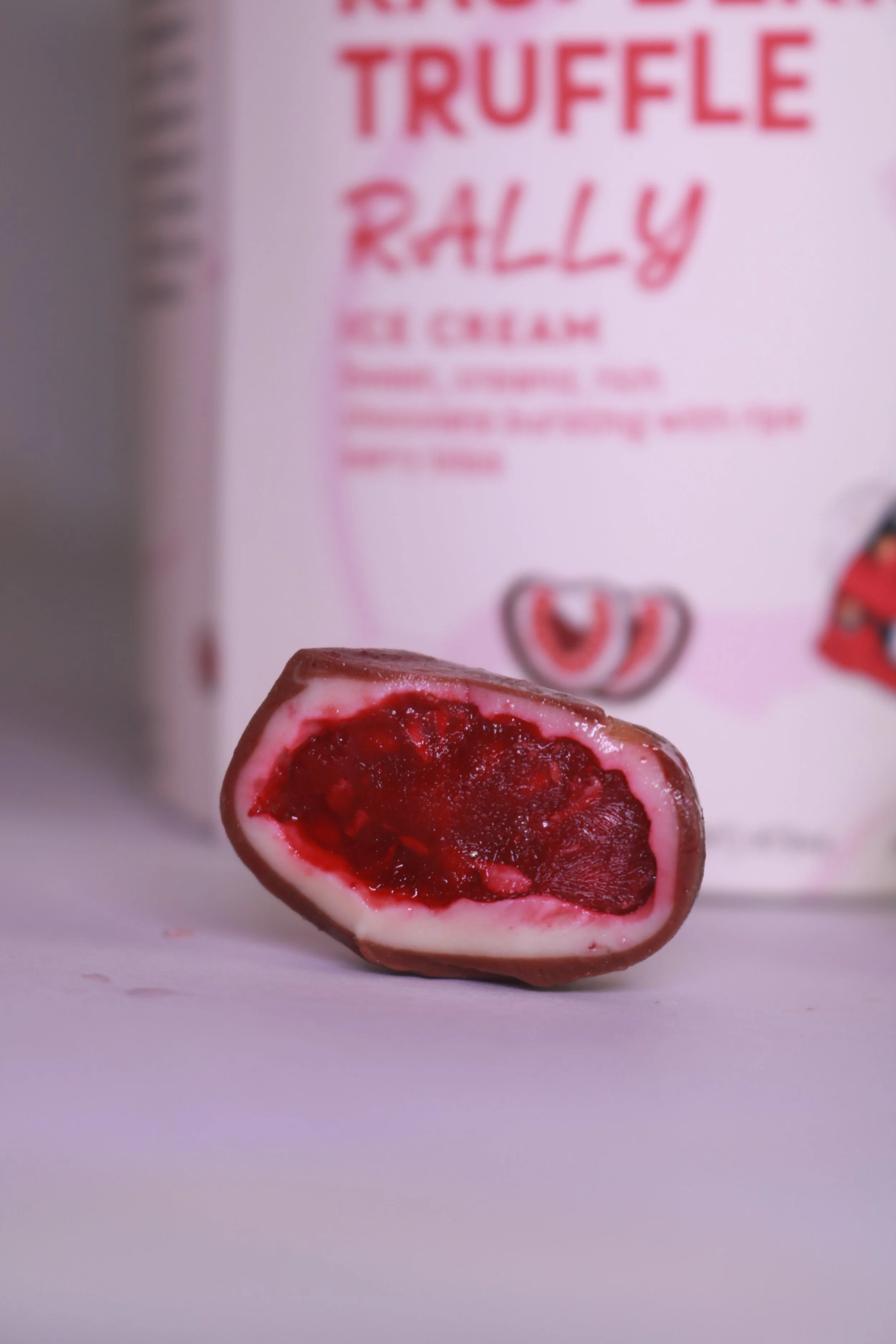
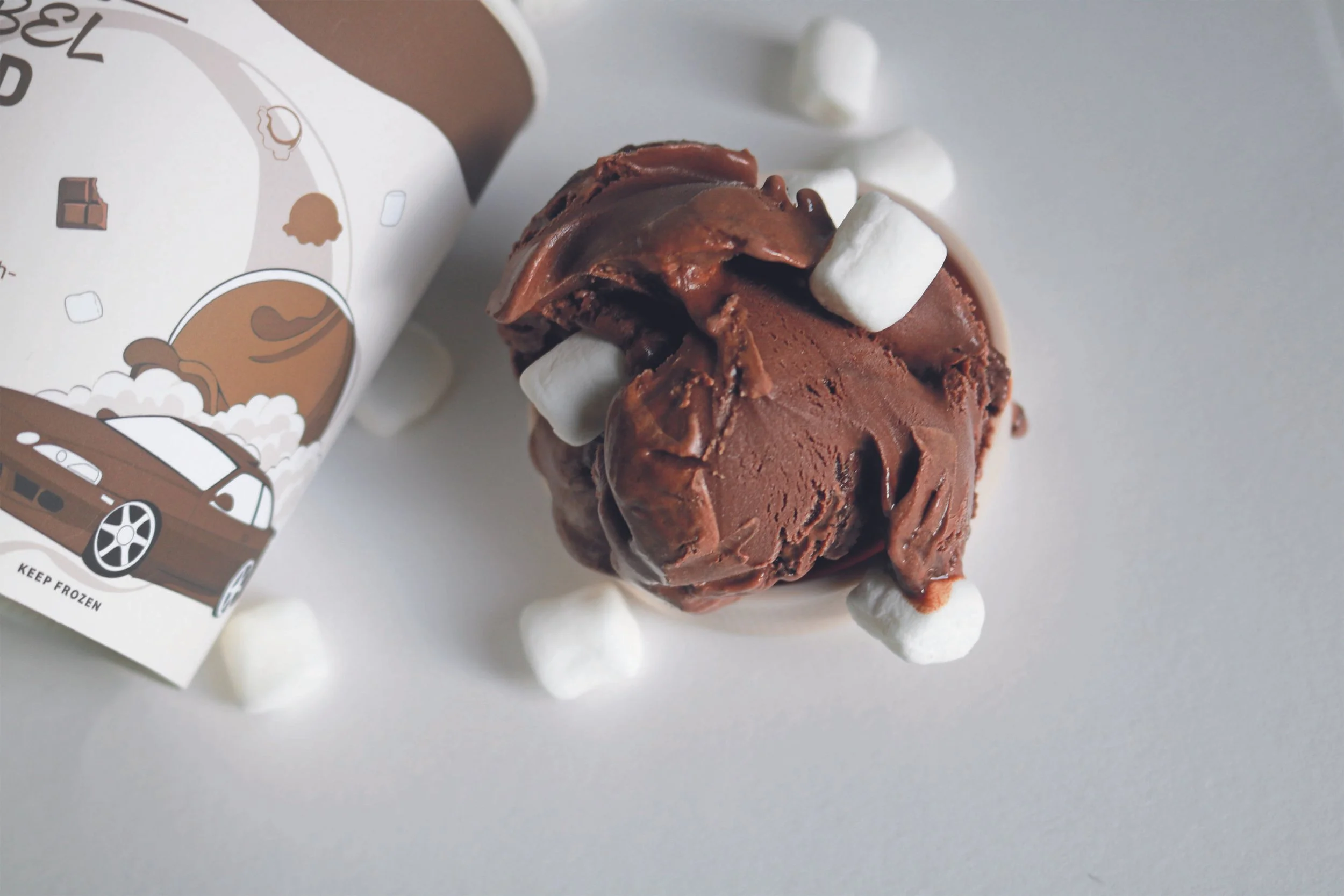
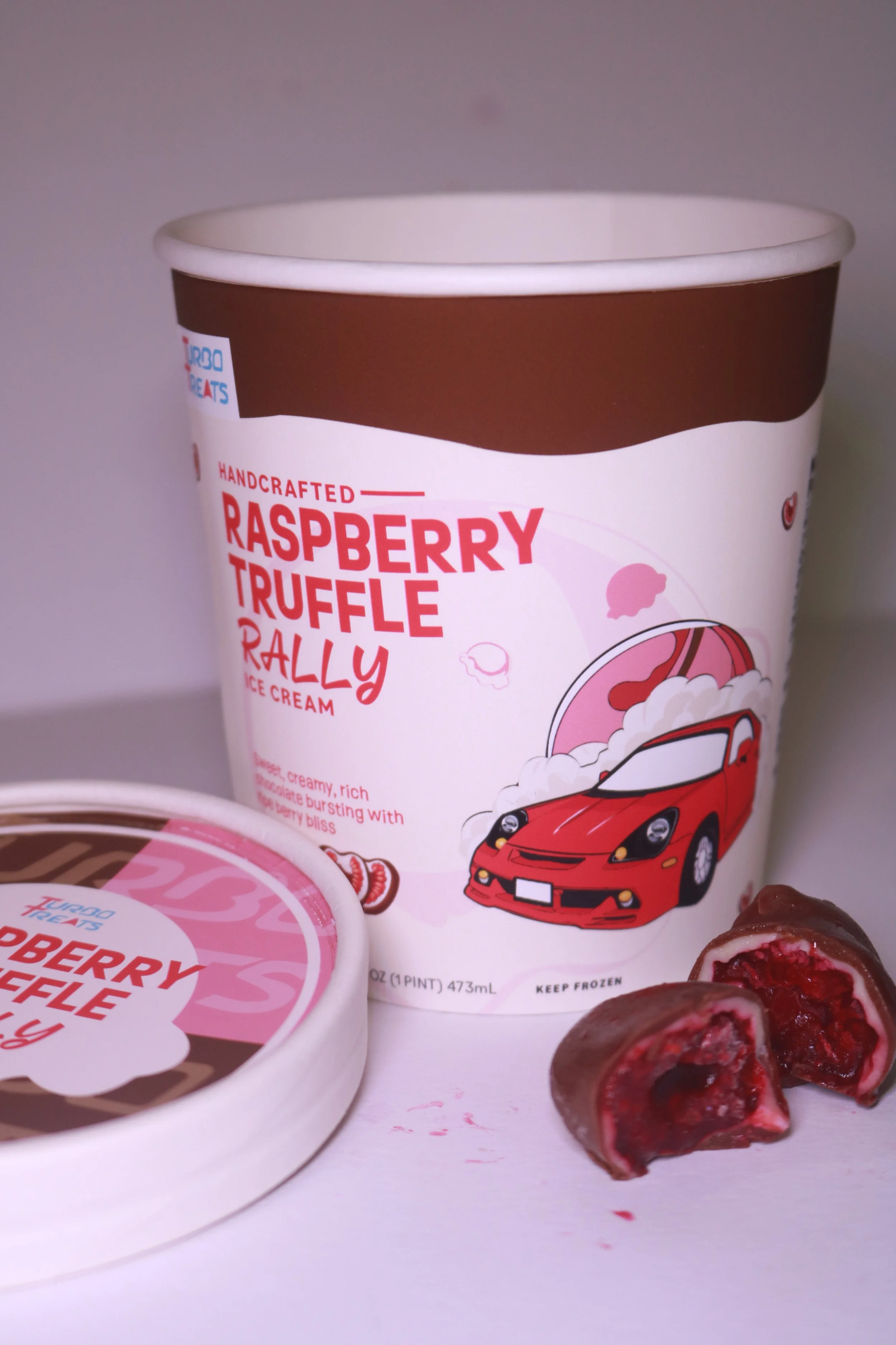
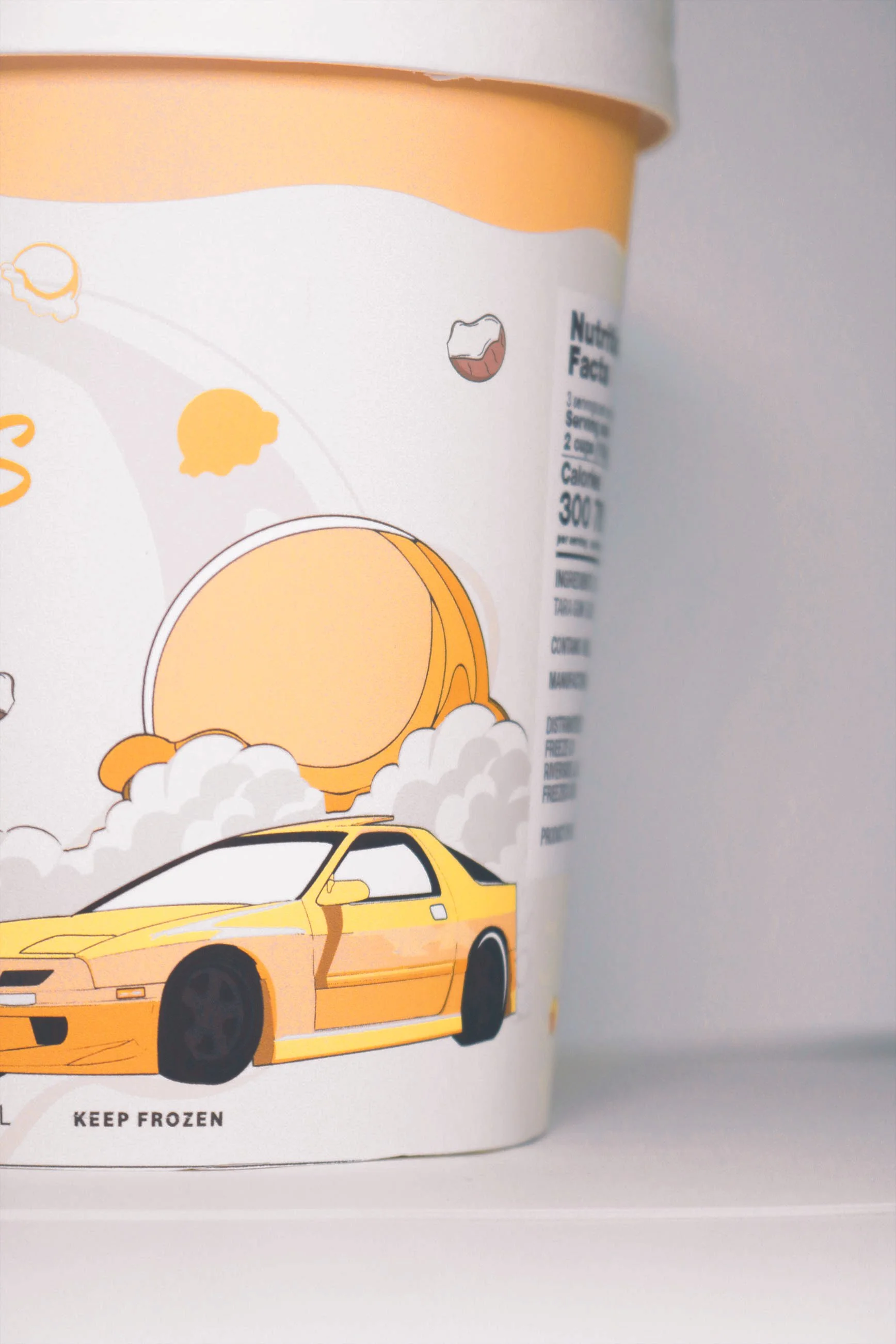
Turbo Treats is a ice cream brand company whose target audience are GenZ and Millennials. This project explores the playful intersection of ice cream and car racing culture, transforming everyday emotional pleasures into fun and adventure through dynamic visual design. Names of flavors are personality-driven (no-pun intended), and the colors of cars distinguish different kinds of flavors.
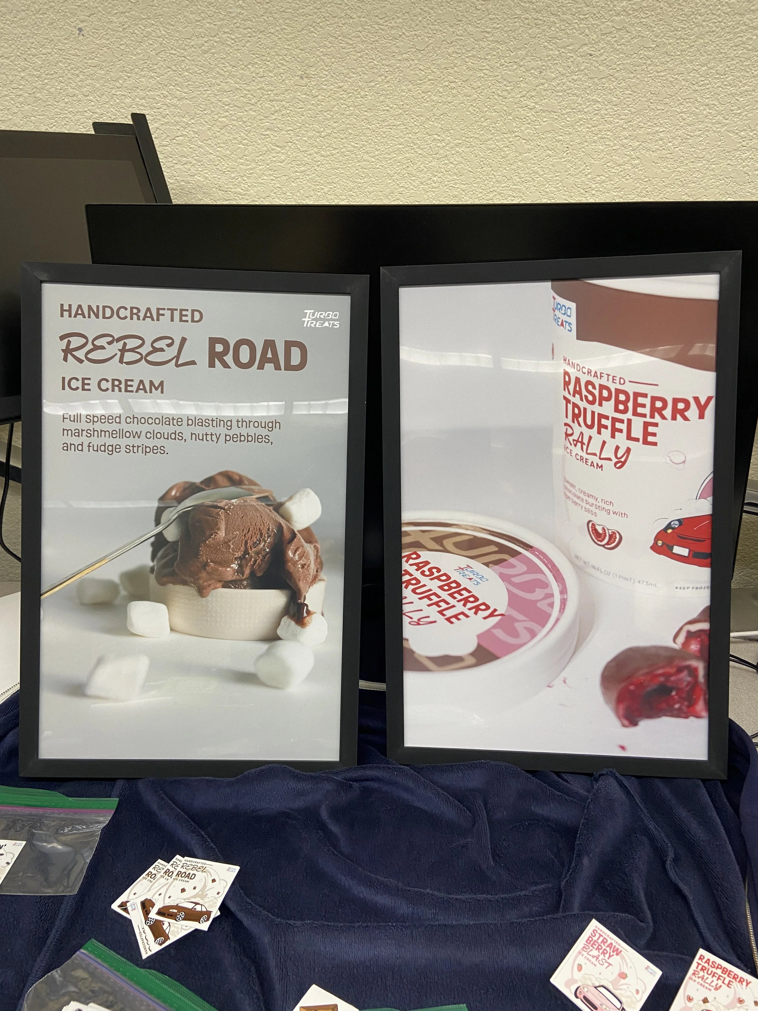
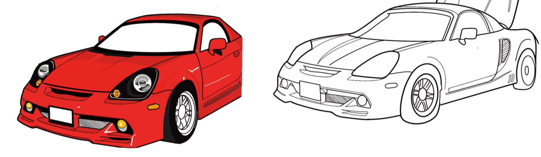
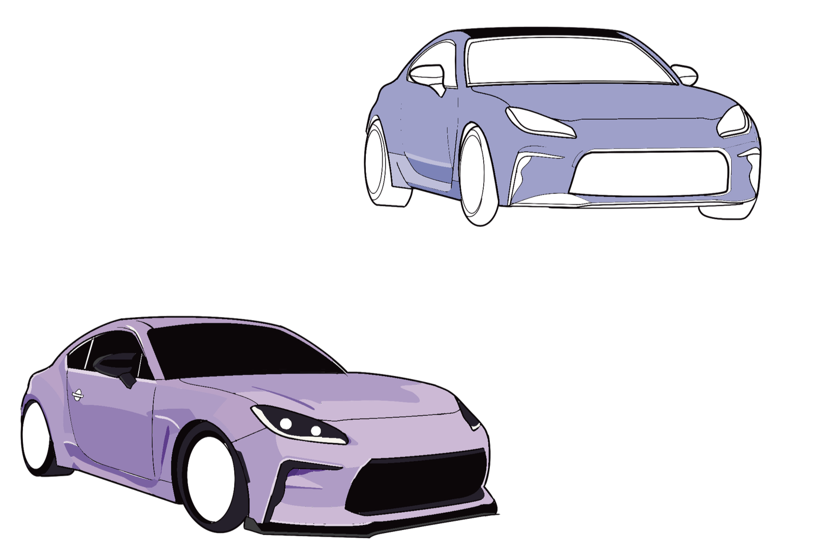
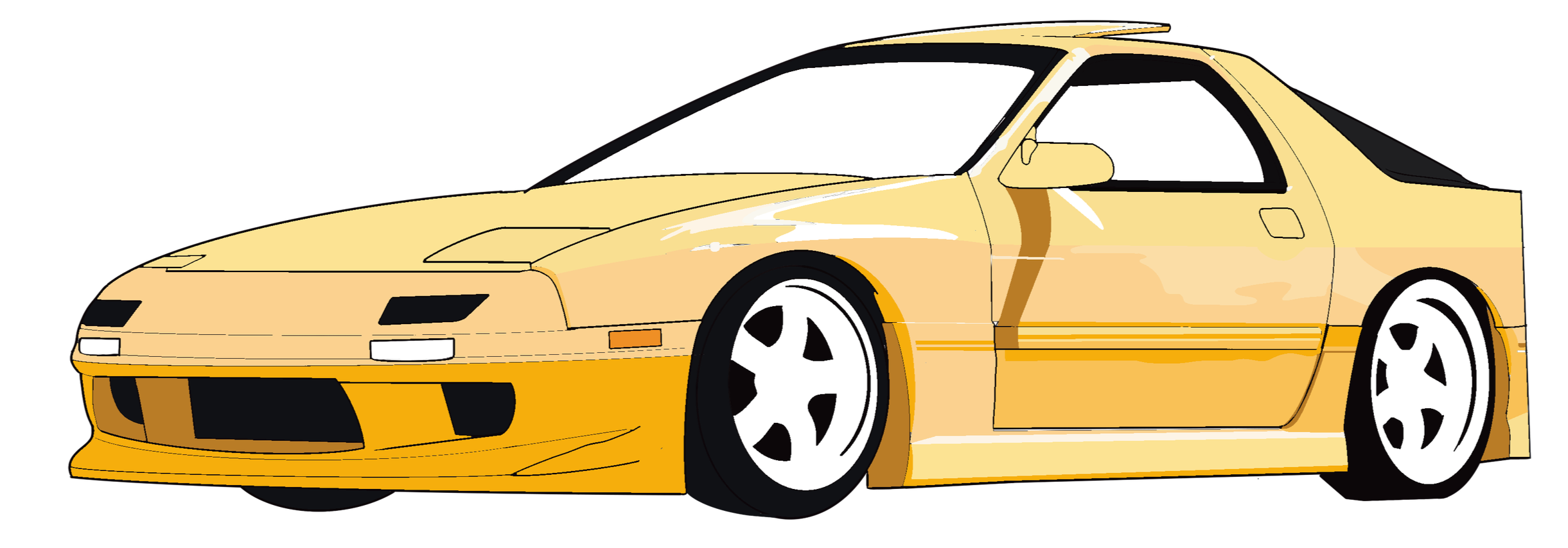
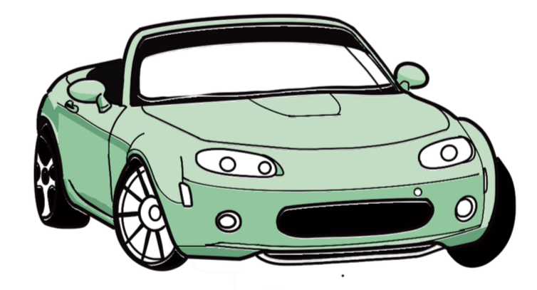
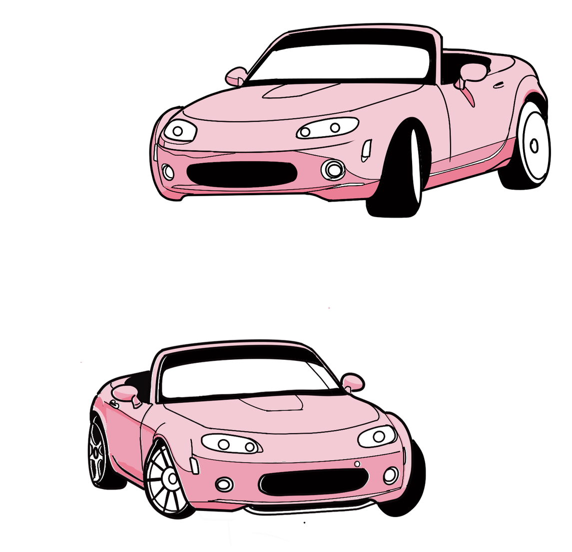
This project is inspired by my hobby in automotive photography. The car, drawn directly from my photographic references, bring a sense of realism yet whimsical integration with ice cream elements. Such as, the “smoke” formed by vehicles carving down the ice scream scoop, which adds a layer of fun and movement. Through the eight (8) products, customers are welcomed to experience the energy, style, and visual celebration of car culture while savoring the cold treat. .
Turbo Treats: Ice Cream Brand Identity and Packaging
Aug 2025 - Dec 2025
logo designs


The design process was long and challenging. Lots of trial and errors in all aspects of design. It involved many reiterations of logo designs, choosing colors, typography, imagery, conveying messaging that communicates the product's quality and emotional connection with the target audience.


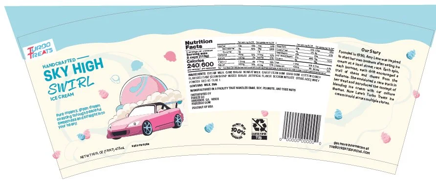
Wrap-Around Label and Lid Templates


The beginning stages was figuring out the correct dimensions for the ice cream wrap-around label. In the initial production, I had assumed that the artwork labels would function the same similarly to flat rectangular packages. However, cylindrical packaging are completely different and involves different visual and technical functions. I treated the artworks as if it were a flat rectangular canvas rather than a curvature.
I had created manual die-cuts using Youtube tutorials but the measurements never came out proper. After applying the artwork to a cylindrical mock-up, it became clear that the design needed readjustment to account for the way consumers interact with round packaging.
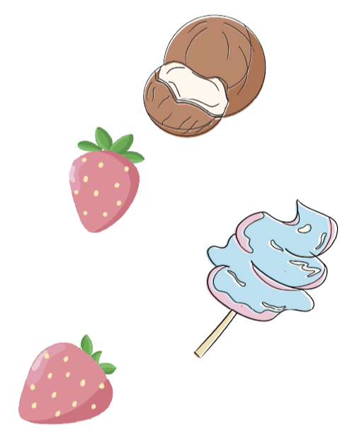
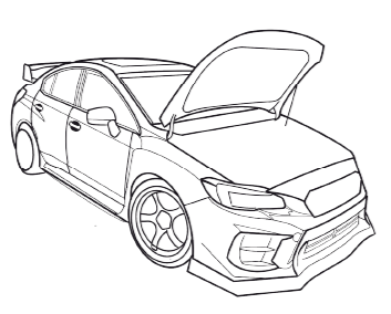
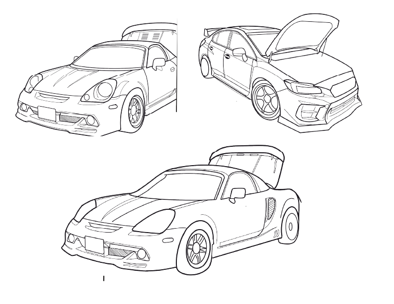
Draft 1: car & flavor icon designs

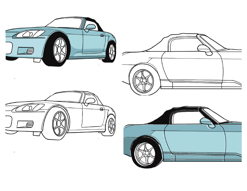
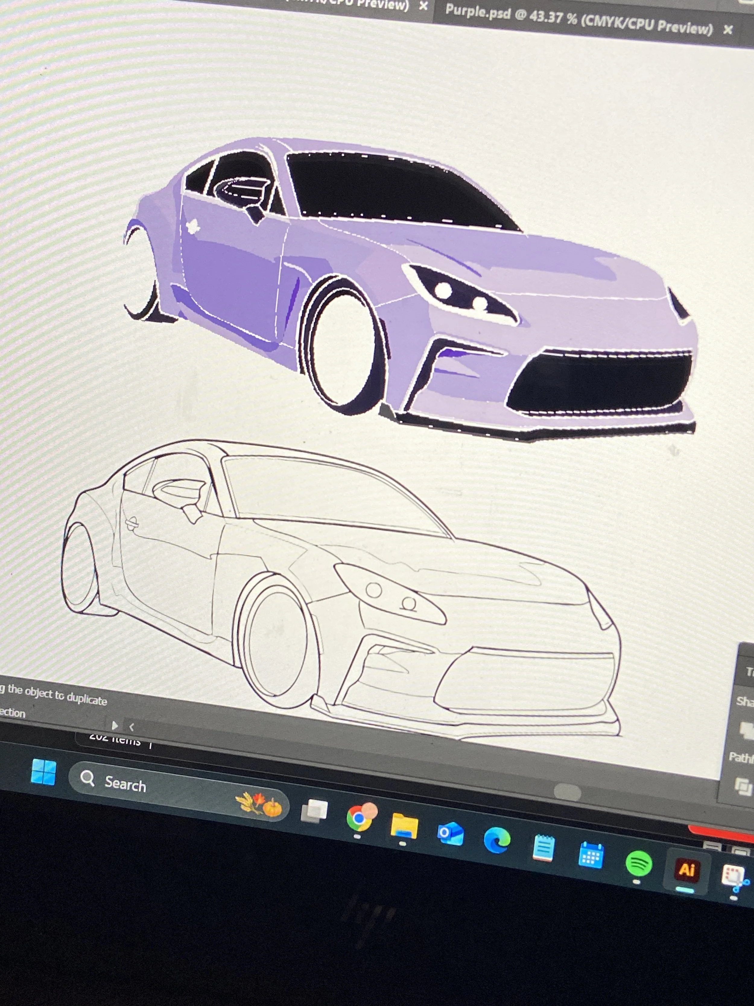
draft 2: car sketch & color
Draft 1: Wrap Around Label (Flat design)

Draft 2: Wrap Around Label (curved)
First attempt at curving the packaging label template (Flat version). Circumference of my actual tub container was measured to be about ~12 inches. Using the “warp” effect in Adobe Illustrator did not make the correct dimensions, and was measured at ~23” on print.
Although the other mock-ups are not shown on this page, I faced challenges in understanding surface behavior on a angled product, as opposed to a flat box product.
During this time, I was also experimenting with different typography design and layout to reflect the brand’s values in movement and adventure, while also ensuring legibility for target audience.
The black lines on the packaging label are my dividers used for organization, hierarchy, and readability.
I worked on flat canvas first before transitioning to a curved canvas so that I can see where certain information are on the label and ensure important elements have enough breathing space. There are 3 separate segments: flavor distinguishment, nutrition label and backstory.
kept the same layout but changed the typography to be more legible
DRAFT 3: Wrap Around Label (flat)
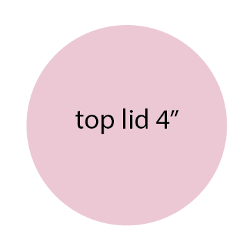
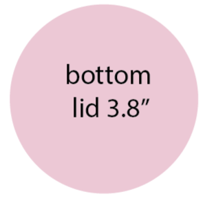
draft 1: lid design


I used a box cutter to disassemble my ice cream tub, laid it out flat, scanned it, and it came out true to size and that became my proper template.
These images show print-ready files and print production.
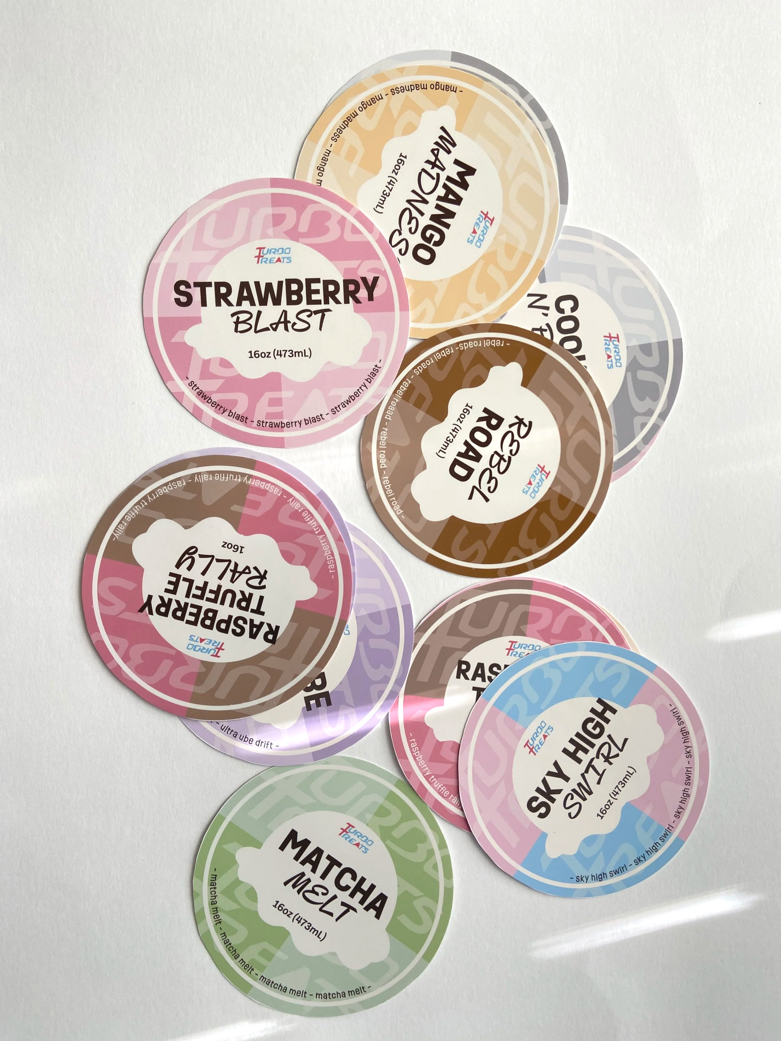
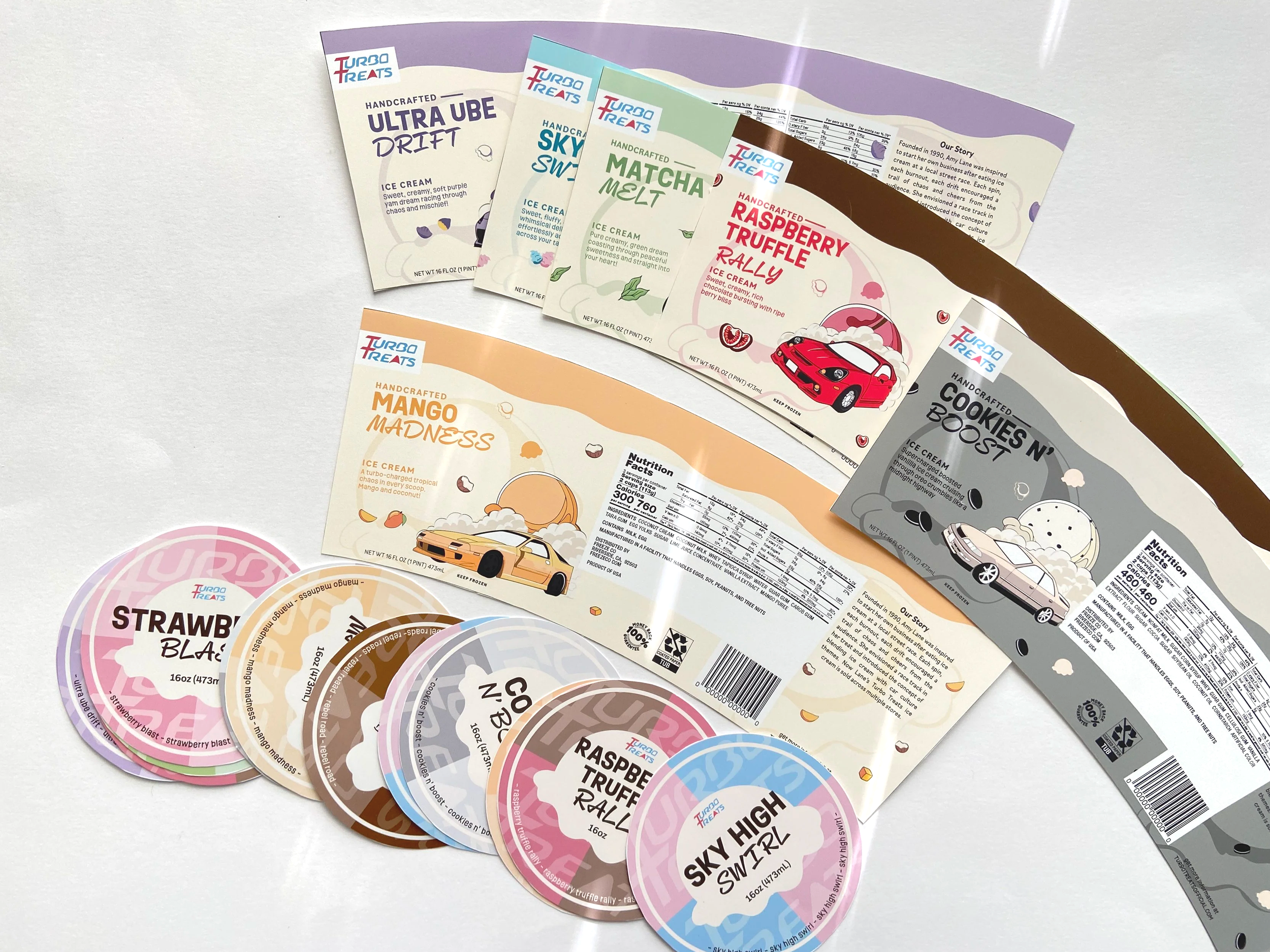
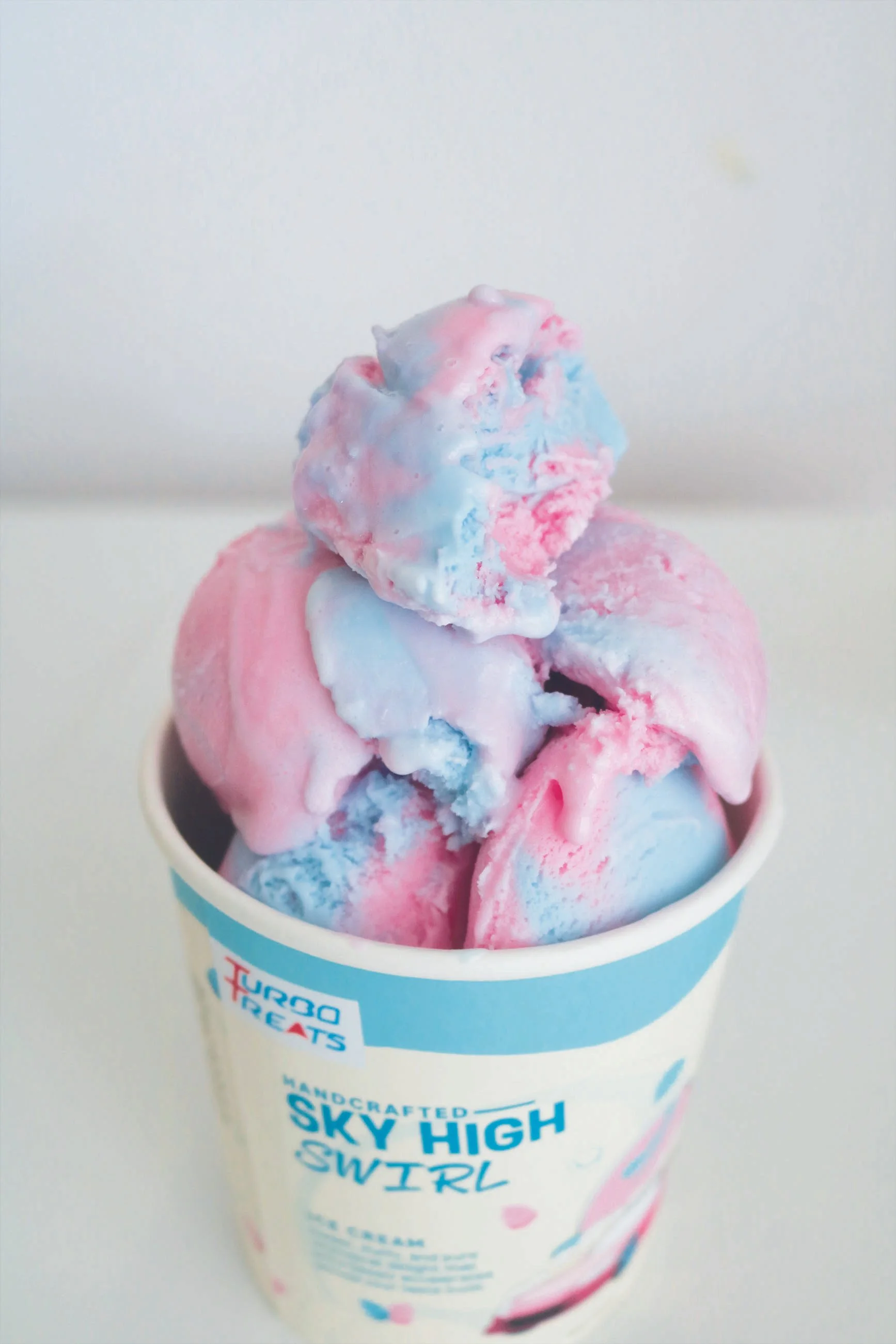
final: Packaging Design (Labels & lids)
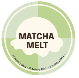
Draft 2: Lid design
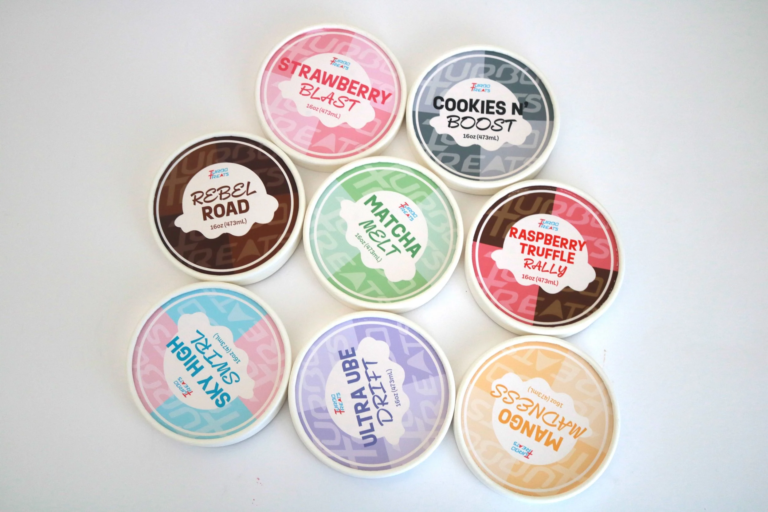
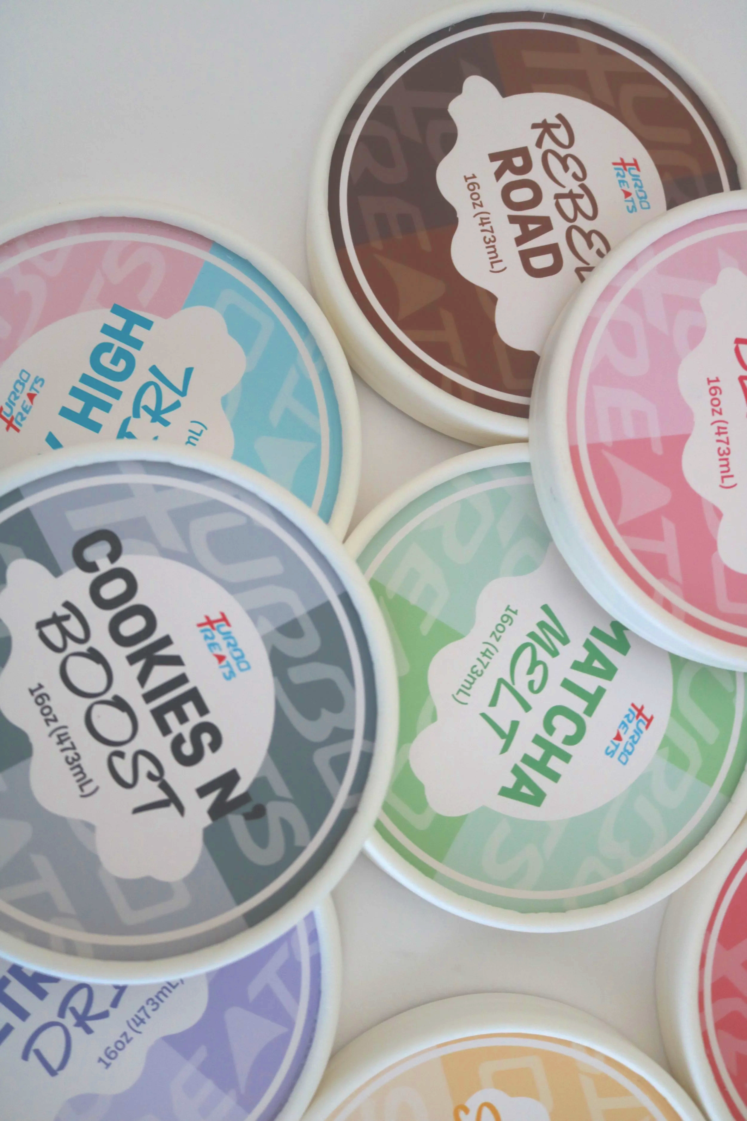
Originally, the dark brown text on the lid design felt too dominant and visually heavy. It wasn’t consistent with the rest of the packaging and drew the attention away from the playful and adventurous values of the brand. I changed the colors to match the flavors to improve clarity, visual hierarchy, and instant recognition on shelves.
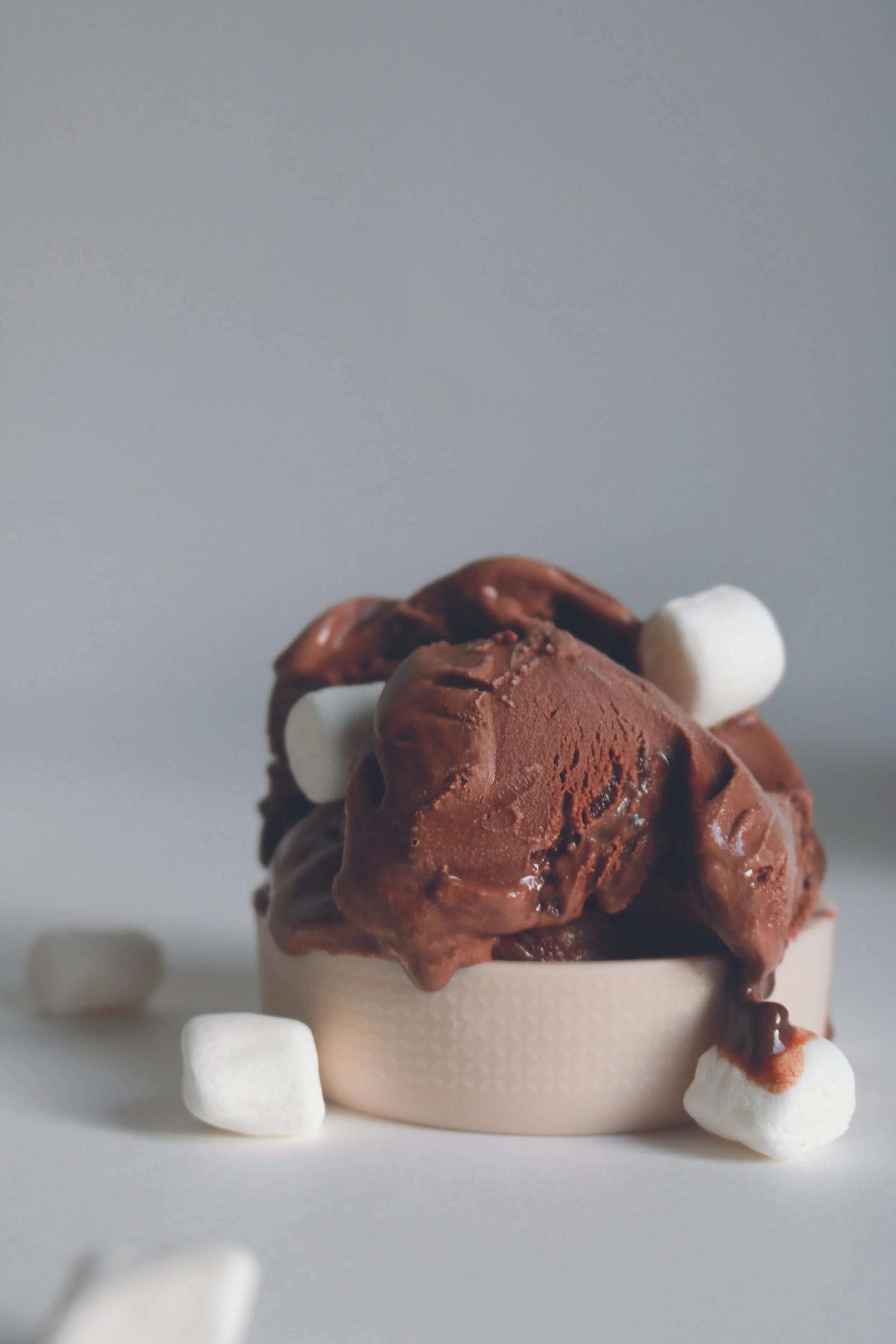
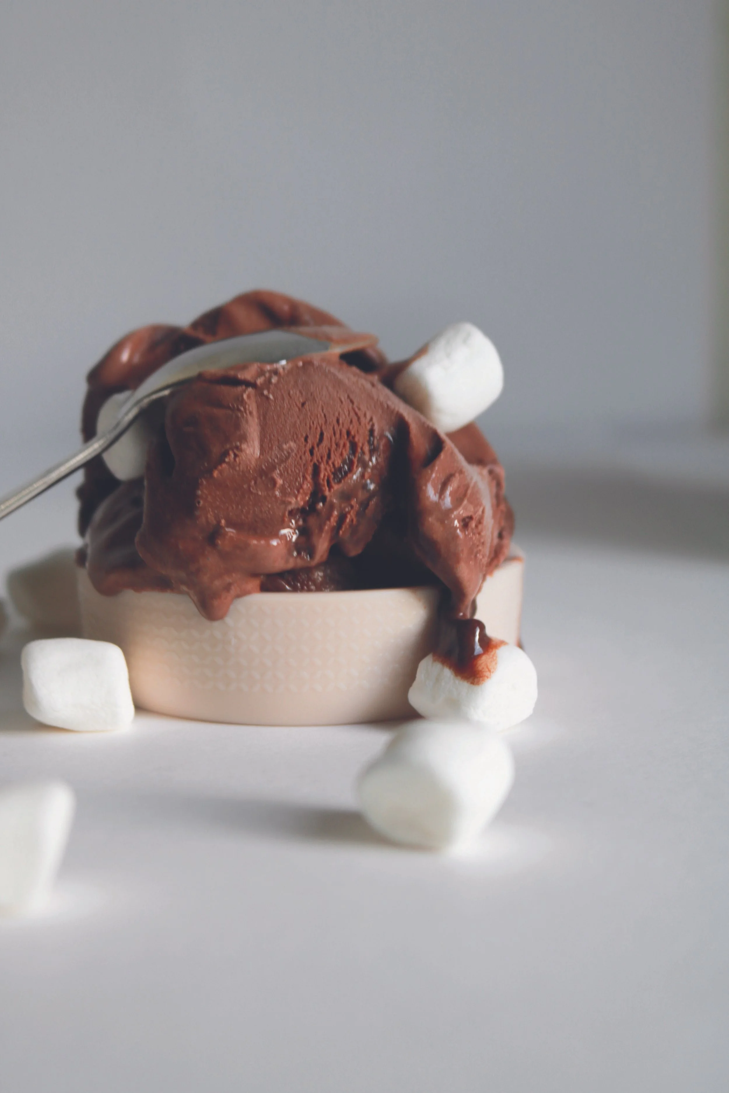
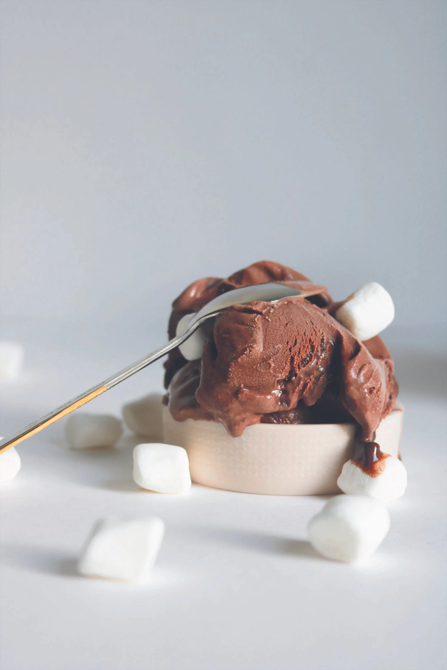
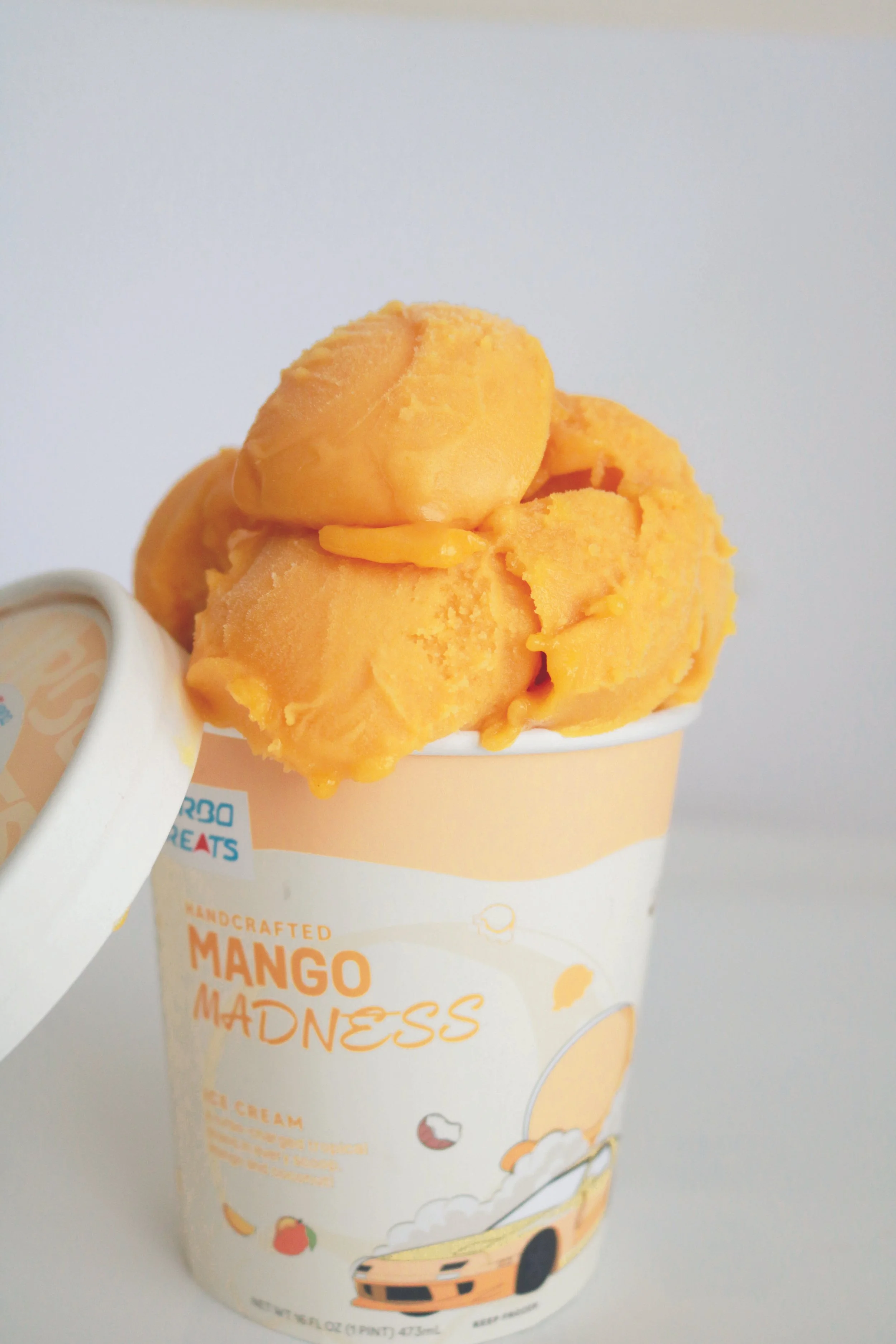
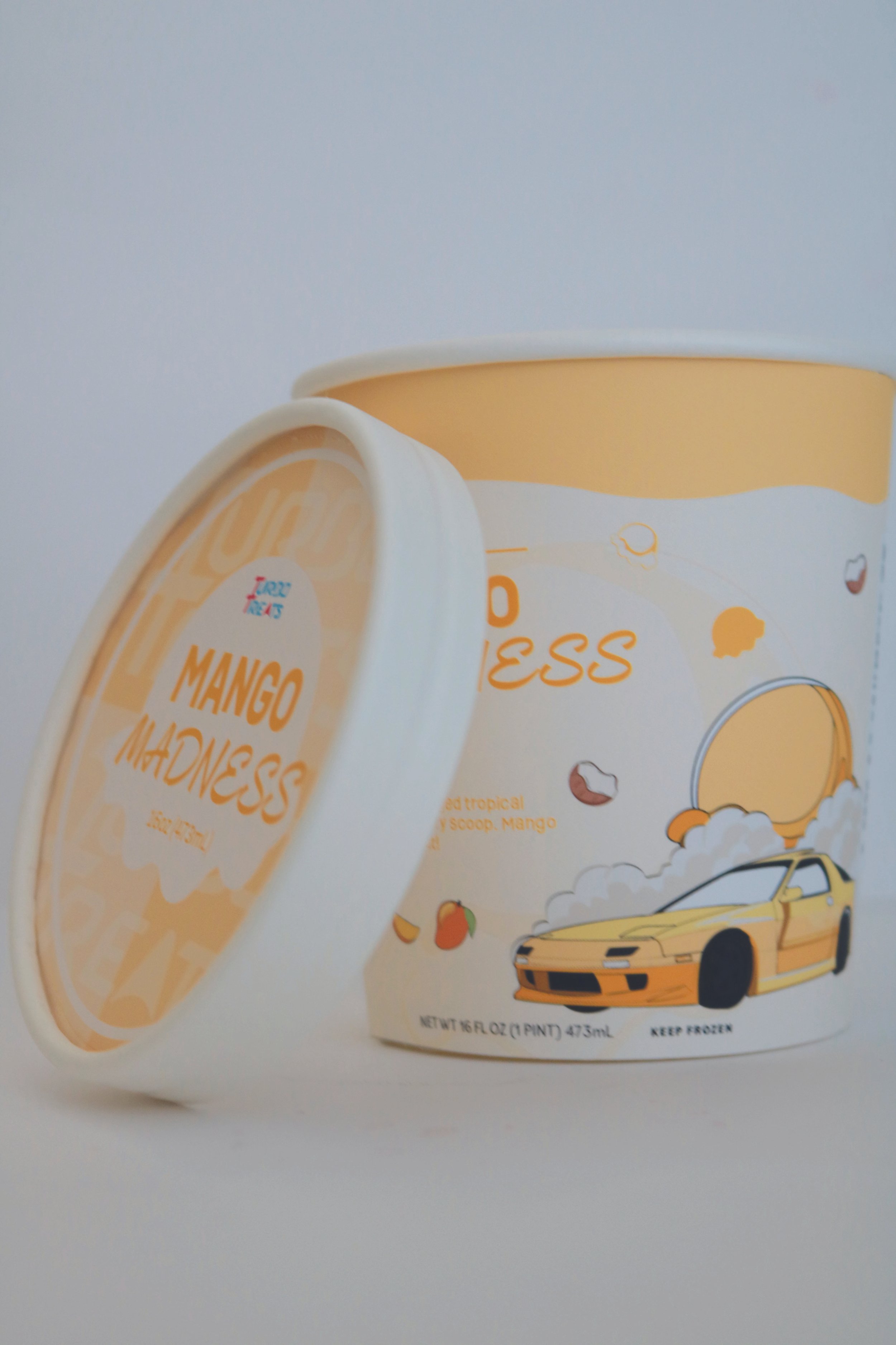
Product PHOTOGRAPHY
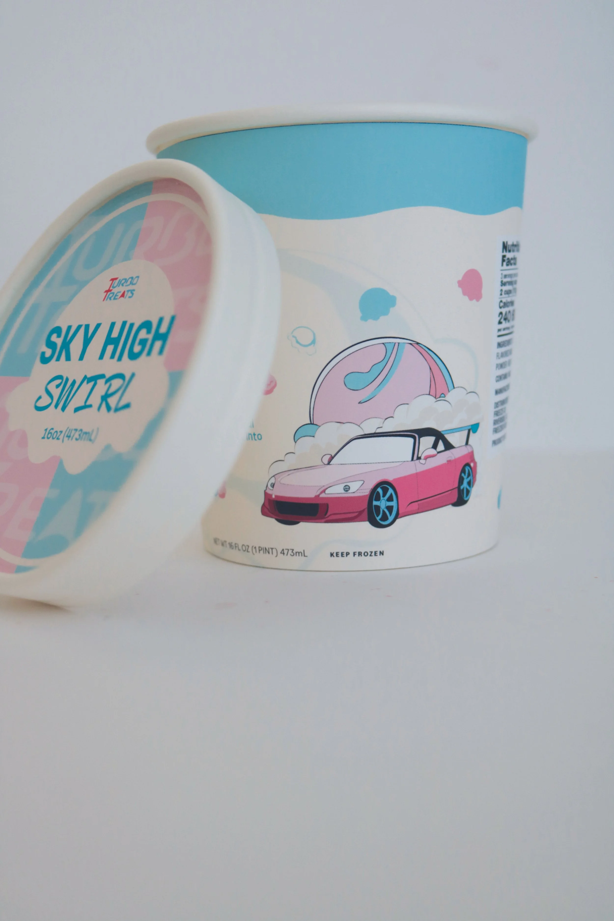
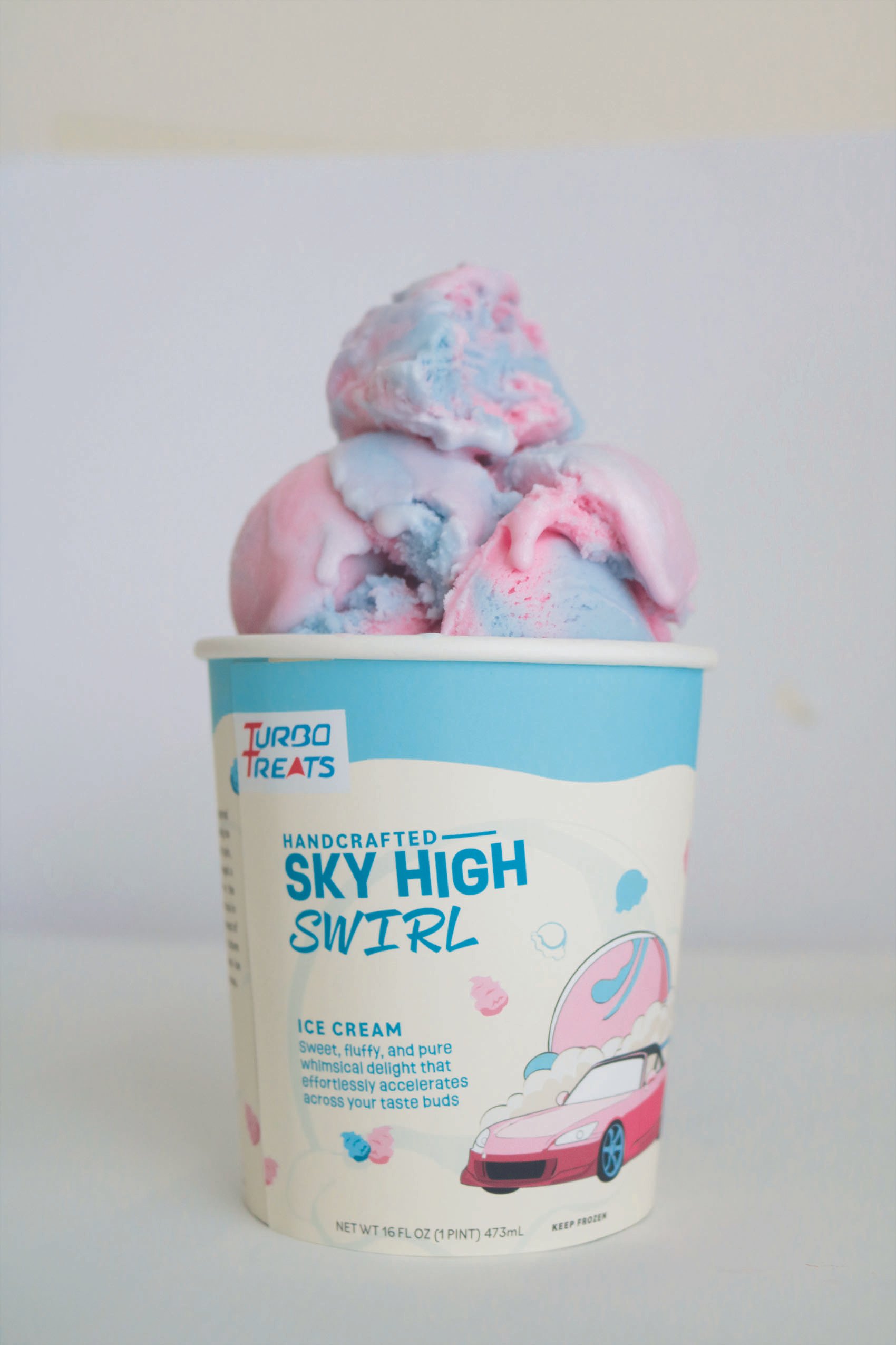
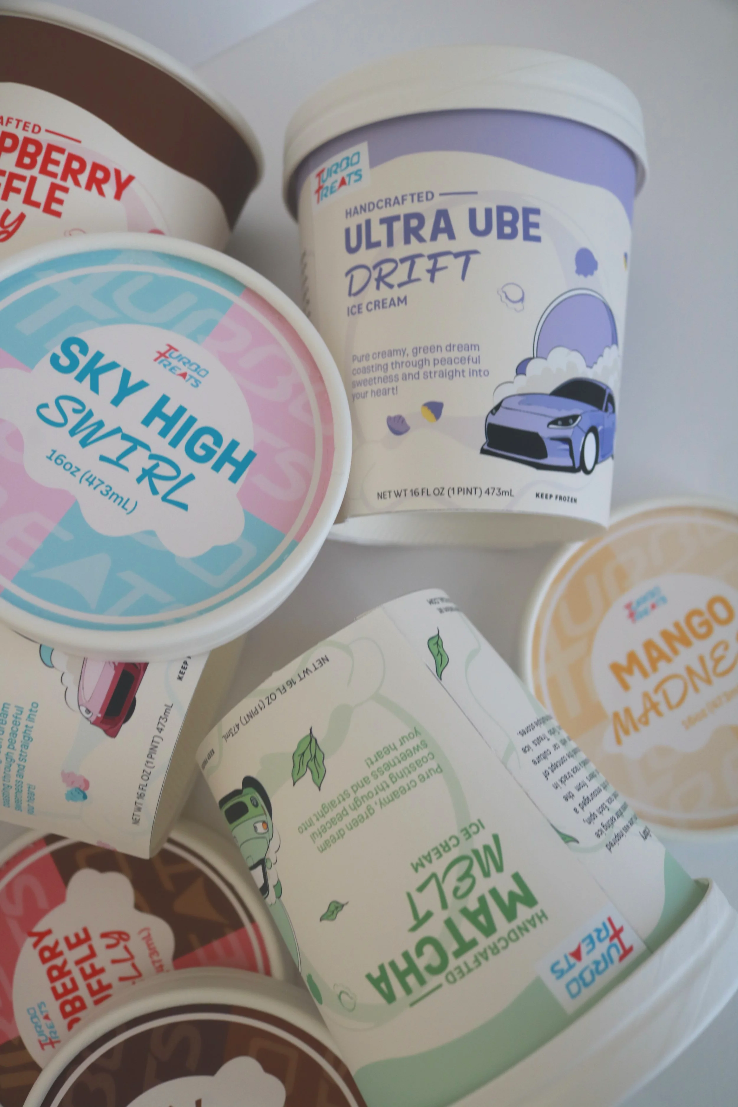
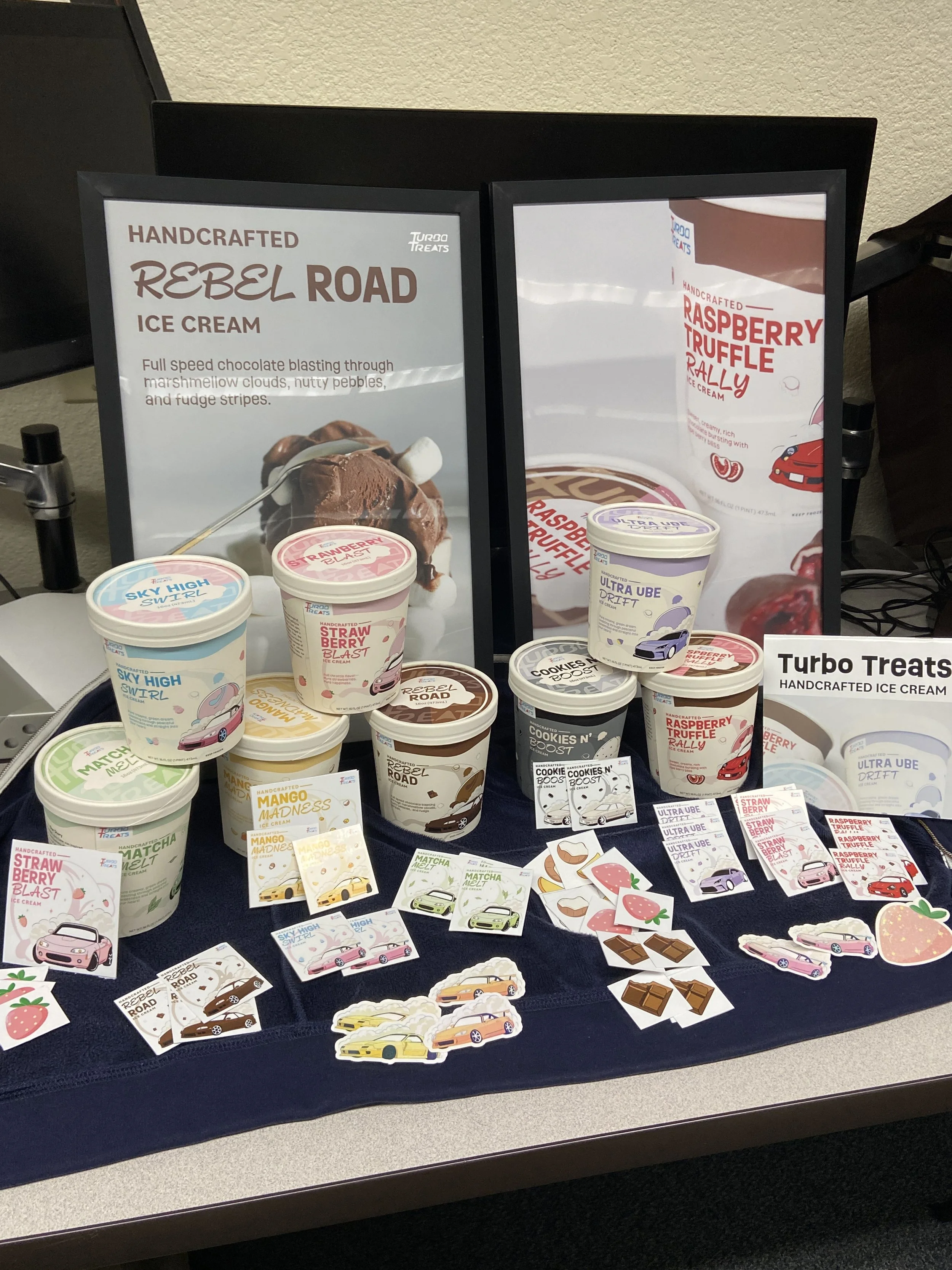
Product packaging & deliverables